Session 28: Styling an HTML Form
This page draws on code created by David Humphrey.
Opening
Today, let's build and style the sort of form that we see everywhere on the web. This process will help us review many of the ideas about HTML forms that we learned about last time and in this week's reading, and to learn several more. It will also give us a way to review some of our CSS knowledge — and to learn some more.
To do that, we need a basic form to work with.
Download this starter code as the base for our work. It contains two files: an HTML file in which to build the form and a CSS file in which we will later define the styles for the page.
I will work in Firefox today. Its developer tools include a panel we will find useful later.
Opening Exercise: Building a User Feedback Form
We see user feedback forms all over the web. Most of them contain fields like these:

Do your work in the HTML file from the starter code. Recall that:
-
Notice that each input element has a label. Use a
labelelement to create the labels. - Notice that when the page loads, the username field has focus.
-
An input element can be of type
date. - If the user hits the tab key, focus moves to the next field to the right.
- The three text fields autocomplete with appropriate data.
-
When the form is submitted, it will be sent to the action
path
"/feedback"using theGETmethod.
The starter code includes a web page with a form that you can use as an example to remind you of details.
A User Feedback Form: Initial Elements
This file defines the elements we need for this form.
Each input comes with a label. The
label's for attribute matches the id
attribute on an input control. These labels display in the
browser.
We will also use the input element's
id in the CSS to target styling on the element.
When the form is submitted to the server, each input field's
name will be sent along with the field's value.
The input element's type attribute
lets the browser help the user enter the correct kind of data.
In particular, the date value tells the browser
to provide a date selector.
The autofocus and tabindex attributes
tell the browser which fields to bring into focus when the page
loads and when the user hits the tab key.
The autocomplete attribute lets the browser help
the user with specific auto-completions. Its value defines
the type of data value to fill in. Here,
username, name, and
email are values the browser understands.
This form is a good start, but it does not include some essential fields, including a way to enter any feedback or to submit the form! Let's add those now, and learn several new bits of HTML along the way.
A User Feedback Form: More Essential Elements
Introduction
A feedback form could use four more inputs:
- a field to enter the kind of problem
- a field to describe the problem in detail
- a field to upload a file containing the problem, and
- buttons for submitting and resetting the form.
A Problem Field, Using a Datalist
Let's add an element to the form so that users can enter a short description of the kind of problem they are having. To help them enter common problems using common names, let's offer a dropdown menu of phrases that can be selected or autocompleted.
This can be done using a new attribute, list.
The value of this attribute connects the input to a
datalist element that lists the options.
<label for="feedback-problem">Problem</label>
<input id="feedback-problem"
  type="text"
  name="problem"
  list="feedback-problems"
  placeholder="I'm having a problem with the..."
  tabindex="5"
>
The datalist element is a container for one or
more option elements.
<datalist id="feedback-problems">
  <option value="Network"></option>
  <option value="User Interface"></option>
  <option value="Documentation"></option>
  <option value="Website"></option>
</datalist>
Notice that this textbox is rendered with a dropdown menu widget. Note, too, the behavior: it finds partial matches on the input text, and the user can select an item to autofill.
A Problem Description, Using a Textarea
Now, let's add an input for the full problem description.
A standard textbox may be too small for this data, and it
doesn't support newlines. Rather than use an
input element, let's use a
textarea.
A textarea is used to create a multi-line text
editing control. It allows the user to enter many lines of
text. Here we use it with one new attribute:
<textarea id="feedback-message"
  name="message"
  placeholder="What's happening?"
  rows="10"
  tabindex="6"
></textarea>
textareas support
many attributes
for controlling the size of the textbox (such as the number
of rows and columns) and its behavior (such as how text will
wrap and how linebreaks will be treated in the textbox's
value).
A File Upload Field, Using a New Text Type
Sometimes, users need to upload a file to the server for us to see or process. We see this sort of thing all the time on the web, including in our HTML and CSS validators, and the course submission system. They require almost no work, because they are built in to HTML now!
We can create an input element with a new type:
<label for="feedback-file">File Upload</label>
<input id="feedback-file"
  type="file"
  name="file"
  tabindex="7"
>
The browser displays this element as a button. When clicked, the browser opens a standard File dialog box for the user's OS, allowing the user to navigate to the desired files. The files are then uploaded to the page, which can include them in the data sent to the server with the form submission.
type="file" offers a few handy features. For
example, if we would like to restrict the type of file that
the user submits, we can use the accept
attribute:
  ...
  accept="image/png, image/jpeg"
  ...
Styling the Form
Our goal is to style the page by making additions only to the stylesheet — no changes to the HTML file!
I picked out two Google fonts in advance, Open Sans and Raleway, and launched the stylesheet with imports from Google Fonts:
@import url("https://fonts.googleapis.com/css?family=Open+Sans");
@import url("https://fonts.googleapis.com/css?family=Raleway");
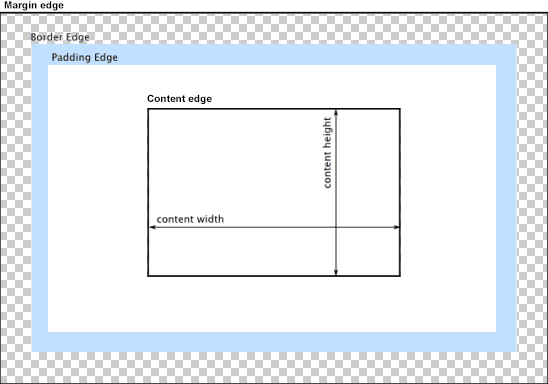
Before styling the form and its elements, let's write a rule that applies to every element. Recall the CSS box model. By default, when we set widths and heights, they refer specifically to the content box. If the component has padding or a border, it will take up more space on the page than its width and height suggests. That works fine for text on the web, but it is not so handy for placing form elements carefully.
Let's have our first CSS rule apply border-box
sizing to all elements in the page. This way, when we set
widths and heights, they refer to the border box, which
includes the padding and the border itself. The selector
* matches all elements.
* {
  box-sizing: border-box;
}
Styling the body: The initial rule was for
display purposes as we developed our HTML. We can delete it
now, because we will be styling the form elements to achieve
the desired appearance. Instead, let's set the font for the
page and give the body a little padding.
body {
  font-family: "Open Sans", sans-serif;
  padding: 1em;
}
Styling the form basics: put some space around the
form, and add a border.
form {
  margin-top: 3em;
  padding: 2em;
  border: 1px solid black;
}
Let's set a max-width for the form, so that it doesn't expand with the window, using the rest as margin.
  ...
  max-width: 800px;
  min-width: 400px;
  margin-left: auto;
  margin-right: auto;
  ...
Now let's use a layout method we only heard about earlier. We can use a grid layout for the items in the form.
Let's create two columns, with most of the width in the
second column. The grid-template-columns property
asks us to specify column widths. These can be absolute, but
that wouldn't play nicely with windows of different sizes, or
with maximum and minimum widths. So we will use
fractional widths instead.
"1fr 3fr" means 1 unit and 3 units, respectively,
for the two columns.
  ...
  display: grid;
  grid-template-columns: 0.3fr 1fr;
  ...
The browser fills the grid in row-major order: label, input; label, input; and so on. If we want to put two items in a single cell, we need to put them in a container.
Now we want to style the grid elements themselves.
Align each item in the grid cell's center, and add 20px of
space between the rows and columns.
  ...
  align-items: center;
  grid-gap: 20px;
  ...
Styling the labels: Use a better font and larger
text size, to make them easier to read.
form label {
  font-family: "Raleway", sans-serif;
  font-size: 1.5em;
}
Let's style the input controls, including the
textarea, so that they are full width in their
cells, use a larger font size, have a light gray border, and
have slightly rounded corners.
input,
textarea {
  width: 100%;
  padding: 0.3em;
  font-size: 1.5em;
  border: 1px solid rgb(206, 212, 218);
  border-radius: 0.25em;
}
With multiple text-like inputs, users can become uncertain
about where they are entering text. We can style the form so
that when an input control has focus, its
border changes color to light blue. We use the
focus pseudoclass, which is similar to the
hover class we've used for links.
input:focus,
textarea:focus {
  outline: 3px solid lightskyblue;
}
Now let's stretch the textarea so that it covers the full grid.
We think of the grid in terms of its columns, but the layout engine works in terms of the lines that define the columns. So we want to tell the textarea to start at 1 (outer left line) and goto 3 (outer right line).
textarea {
  grid-column: 1 / 3;
}
Notice the effect on the subsequent items in the grid...
The browser treats the buttons as separate items, one in each column. With columns of different size, we end up with buttons of different size. We'd like them to be the same size, and we might like to place them in a specific location, say, in the lower right-hand corner of the form.
Let's add a div element to group the buttons, so
that the CSS will treat them as a single unit in the grid
layout. This is the only change to the HTML
we need to make!
<div class="buttons"> ... </div>
Notice that the buttons now occupy the same cell in the grid, and return to a more normal size.
Now let's move the buttons to the right side of the right column. This means we want them to stretch from line 2 to line 3.
.buttons {
  grid-column: 2 / 3;
}
Let's resize the two buttons and make them stand out a bit
more. The buttons are actually input elements.
We don't want to apply this style all the inputs, so we need
to identify the buttons using a new kind of selector, an
attribute selector.
input[type="submit"],
input[type="reset"] {
  width: 150px;
  background-color: rgb(0, 123, 255);
  color: white;
}
With the buttons at a more normal size, they no longer expand
to fill the grid cell. To keep them at the far right of the
form, we can use use the text-align property.
We've used it to center items in the past, but we can also
shift items to the left or right.
.buttons {
  grid-column: 2 / 3;
  text-align: right;
}
Finally, let's add one more stylistic touch to the buttons, to highlight them whenever the user hovers or focuses them. This requires us to write a selector that combines an attribute with a pseudoclass!
input[type="submit"]:hover,
input[type="submit"]:focus,
input[type="reset"]:hover,
input[type="reset"]:focus {
  background-color: #0069d9;
}
With this style sheet and one change to the HTML, we have an HTML file and a CSS file that looks really nice!
Closing
Be sure to submit your final index.html and
styles.css files before you go.
I returned Midterm Exam 2. Add your two exams scores to get a percentage out of 100. Recall that together the exams are worth 40% of the overall grade.
The final project is live and due at the end of next week.
Next week, we will work more on forms and styling and then wrap up the a course.