Week 14: HTML Forms
This reading draws heavily from a page by David Humphrey.
Recommended Readings
- HTML Forms at MDN
- Learn Forms at web.dev
- Designing Efficient Web Forms
HTML Forms
Up to this point in the course, most of our web pages have been read-only from the point of view of users. A user could read, view, or listen to content on the page, and maybe interact with it via JavaScript. However, we haven't given users a way to share data with us.
HTML forms give users a way to enter data on a web page. This data can be used directly in the page (for example, to change display options) or sent on to a web server (for example, to log into a site).
Every time we enter a search query, purchase an item in an online store, or login to a site, we are using forms.
The Essential Elements
An HTML form is created using a number of special-purpose elements. The browser provides the user with custom components associated with these elements for entering, modifying, or even uploading data. This week we will learn a bit about how to create, use, and style these form elements.
The Input Element
The most common type of input control is the
input
element. As we saw in
a teaser before break,
input offers a simple yet powerful way to enable
users to give us data. It also offers more features with
even more power.
An input element is one of the interactive form
controls we can use to accept data from the user. There are
dozens of different types,
with new ones still being added. These include buttons,
checkboxes, and various kinds of text. For now, we will
focus on the input element.
Here is a basic input element for a user to
enter their name in a textbox:
<input type="text" name="first-name" id="name">
Notice that input elements are empty; they have
no content and therefore no closing tag. All of the
element's information is defined using attributes. In this
example, there are three:
-
The
typeattribute tells the browser what kind of input widget to provide to the user. The value"text"indicates that this form control should be rendered in the page as a generic textbox. Later in this reading, we will see a number of special-purpose text boxes. -
inputelements usually have anameattribute that is used later as the name for the value entered by the user. Think of it as something like a JavaScript variable, only in HTML. In this form, the value entered by the user will be calledfirst-namewhen the form gets processed. -
As with all HTML elements, it is common (but not required)
for an
inputcontrol to have anidattribute that uniquely identifies the control.
There are many more input types and attributes, some of which we will see in examples and other sections of this reading.
The Form Element
An input element creates a way for users to
enter a single value. However, many forms on the web require
the user to enter multiple values of different kinds. We
need an element for defining groups of inputs that make up a
single form.
The form element represents a section of a web
page in which a user can enter and submit data. Inside a
form, we can define one or more interactive controls for the
user to employ.
In the form tag itself, we define information
the browser uses to send the user's data to a server. For
example:
<form id="data" action="/submit" method="post">
  ...
</form>
The form's action attribute defines the URL
where the data will be sent when submitted. In this example,
the value /submit means "send this data to
the same web server as the page was served from, to the
/submit route”. Sometimes you will also see
action="#" to indicate that the form is to be
processed in the browser and not sent to any server.
The method attribute tells the browser which
HTTP method to use when submitting the data. By default,
this is GET, which means that all form options
will be encoded and sent as part of the URL. These are the
query strings
we often see at the end of the URL, for example:
?animal=panther&color=purple.
If we have to submit a lot of form data, though, the
GET method will not work, because URLs have a
maximum length. In those cases, we can use
POST, which puts the information into the header
of the HTTP request itself instead.
Many of the details of the form element involve
interaction with server, which is beyond the scope of this
course. We will use form only as a container to
group input elements that make up a coherent form.
Now, let's look at two classic real-world forms to see how they were built, and then consider the wider set of alternatives that are available.
Classic Form #1: Google Search
The Form
Our first example is the most popular form on the web:
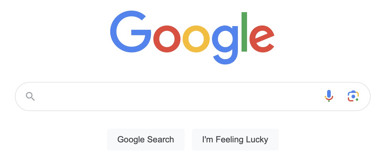
Here is a simplified version of the HTML that created the classic Google search form:
<form action="/search" method="GET">
  <input type="text" name="q" title="Search" maxlength="2048">

  <input type="submit" name="btnK" value="Google Search">
  <input type="submit" name="btnI" value="I'm Feeling Lucky">

  <input type="hidden" name="source" value="hp">
  <input type="hidden" name="ei" value="qIXxW6O0FeTMjwT1zpioCA">
</form>
Let's examine this code for a moment and try to understand what's happening.
First, notice that all of the input controls — the
search text box and both buttons — are grouped together
inside a form element.
The form element has the same two attributes we
saw in
the small example above.
action="/search" tells the browser to be submit
the form's data to the URL
https://google.com/search.
The method="GET" attribute tells the browser to
encode the data in the URL string, because the amount of data
being sent is small enough that it can fit everything in the
URL.
The form contains five input control elements.
Google uses the most common form control, input,
to build the form, with three different kinds of
control:
The first input element is a
text input control. This control is
rendered as a textbox in the browser, into which the user
will enter text with the keyboard. The default type of a
form control is text.
As discussed above, all input elements need a
name attribute to uniquely identify the input's
value. In this case, the name is "q", which is
short for query. The user will provide the
value when they type into the box. Note the use
of the maxlength="2048" attribute, which tells
the browser not to let the user type more than 2,048
characters into this textbox.
The next two input elements are
submit input controls, with
type equal to "submit". A submit input control
tells the browser to submit the form's data whenever the
button is pressed, using the method and action given in the
form element.
Finally, this form includes two
hidden input controls, named "source" and
"ei", respectively. With a type of hidden, they
are not visible to the user. Instead, they define extra
information that the browser will pass on when it submits the
form. The name="source" element records that
the search originates from the Google home page (value="hp").
The name="ei" element is a special timestamp
that records when the query was made
(value="qIXxW6O0FeTMjwT1zpioCA").
A Simple Example
Suppose that the user enters cat pictures into
the textbox and clicks the Google Search submit
button. The browser will submits the form to
/search as a GET request, encoding
all the values in the form into query string values on the
URL:
https://www.google.com/search?source=hp&ei=qIXxW6O0FeTMjwT1zpioCA&q=cat+pictures&btnK=Google+Search
The first part of the URL,
https://www.google.com,
identifies the origin on the server.
The field /search identifies the path to the
resource on that server.
The rest of the URL, beginning with ?, is a
query string that contains these submitted form values,
separated by &s:
source=hp,ei=qIXxW6O0FeTMjwT1zpioCA,q=cat+pictures, andbtnK=Google+Search
A user can manually enter that URL into the browser's search
bar and get the same search results. However, by using an
HTML form, the web page gives the user a more
convenient way to provide the information, and then creates
the URL for the user.
Classic Form #2: AirBnB Search
Our second example is AirBnB's classic search form, which is buried on the website these days:
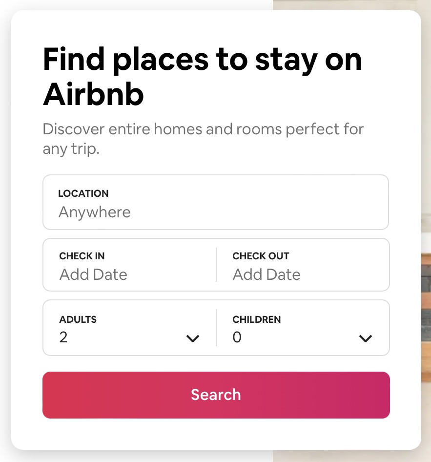
Here is a simplified version of the HTML used to create it:
<form action="/s" id="MagicCarpetSearchBar">
  <label for="search-bar">WHERE</label>
  <input
    type="text" name="query" placeholder="Anywhere" value=""
    autocomplete="off" autocorrect="off" spellcheck="false" id="search-bar"
  >

  <label for="checkin_input">CHECK IN</label>
  <input
    type="text" name="checkin" placeholder="dd-mm-yyyy"
    value="" readonly="" id="checkin_input"
  >

  <label for="checkout_input">CHECK OUT</label>
  <input
    type="text" name="checkout" placeholder="dd-mm-yyyy"
    value="" readonly="" id="checkout_input"
  >

  <label for="adults_input">ADULTS</label>
  <select name="adults" id="adults_input">
    <option value="1">1</option>
    <option value="2" selected>2</option>
    <option value="3">3</option>
    <option value="4">4</option>
  </select>

  <label for="guests_input">GUESTS</label>
  <select name="guests" id="guests_input">
    <option value="0" selected>1</option>
    <option value="1">1</option>
    <option value="2">2</option>
  </select>

  <button type="submit">Search</button>
</form>
This form does many of the same things as the Google form, so let's focus on the new features.
The form element does not specify a method, which
means the browser will use the default submission method, GET.
The data will be sent to
https://www.airbnb.com/a/discover/s.
Notice, though, that the form uses a button
element for submission instead of an input with
type="submit". A button can be used anywhere
inside of a form when the user needs to have a clickable widget.
Each of the five input control elements is accompanied by a new
HTML element,
label.
This element adds a text label to the input control whose id
matches the value of its for attribute.
Rather than leaving the value attribute unspecified
while waiting for the user to enter one, this form explicitly
defines empty values for the three text input controls.
Each text input control also has a placeholder
attribute. A placeholder is a hint to the user about what to
enter (a location such as "Anywhere") or the desired format
(such as "dd-mm-yyyy"). This text is not part of the value and
is not sent to the server. It is usually rendered in a lighter
color and disappears when the user starts typing.
The text input control labeled WHERE uses several
new input attributes for processing text:
-
autocomplete: turn autocomplete on or off -
autocorrect: an Apple extension to the web that indicates whether or not to have the browser offer to autocorrect text entered by the user -
spellcheck="false": whether or not the browser should offer to check the spelling of the text entered by the user
Finally, two of the input elements have a
readonly attribute. readonly is an
empty attribute that is either on or off. These fields have
the readonly attribute set, so users may not
modify the value of the field. How do they enter a value?
Notice that when we click in the field, a calendar widget pops
up. (This page uses a JavaScript listener to respond to the
event!) We select a value for the field using the widget.
In addition to using text inputs and a button, this form also
uses dropdown menus for the numbers of adults and guests.
These menus are defined using the
select element.
(You can learn more about select
at MDN.)
The idea is this: The select tag defines a
name for a value from the user, just like
input does. Rather than letting the user type
freeform text, this element shows the user a dropdown menu of
options.
The dropdown menu items are listed as option
elements in the body of the select. Each option
specifies a value (the data that will be sent when
the form is submitted) and the text to display in the menu. If
an option has a selected attribute, the browser
will show that value as the default value when the page loads.
In the Airbnb example, users can select between 1 and 4 adults and between 0 and 2 guests. The menu loads with 2 adults and 0 guests selected as the initial values.
Input Control Types and Other Attributes
The textbox is an especially handy input device. Before we
move on to styling, let's take a look at some of the other
features available with HTML's input control.
Custom Text Types
HTML defines many custom values for the type
attribute, to support the different kinds of data users need
to enter:
-
<input type="tel">: telephone number. On mobile devices, the keyboard will show a number keypad instead of the standard typewriter letters. -
<input type="url">: URL. On mobile devices, the keyboard will show url-specific buttons, such as.com, to make entering URLs easier. The browser can also validate that the URL begins withhttp://or another valid protocol. -
<input type="email">: email address. On mobile devices, the keyboard will include keys like@and.to make it easier to enter an email address. -
<input type="number">: a number (an integer). On mobile devices, the keyboard will switch to a number pad. -
<input type="range">: a number in some range, between two values. Many devices will display a slider, making it easier to switch among acceptable values. -
<input type="date">: a valid date. The user is typically provided a special-purpose date control, such as a monthly calendar, for entering acceptable values. HTML also supportsweek,month, andtimetypes. -
<input type="color">: a color. The browser often provides a color picker control from the operating system to allow users to select a color visually.
The list of types is longer than this one. If you are creating text boxes, it is worth familiarizing yourself with the available options. Many of these types come with type-specific input widgets in the browser and especially on mobile devices.
Hints
Most browsers try to autofill common field information for users. As a web developer, you can improve user experience with your forms by giving the browser hints about the data you are expecting in each input field.
We do this using standard values for the
name="..." and autocomplete="..."
attributes on a form control. For example, if we needed a
username:
<label for="username">Username</label>
<input type="text" name="username" id="username" autocomplete="username">
Or, if we want to ask for a user's mobile telephone number:
<label for="mobile-num">Mobile Number</label>
<input type="tel" name="mobile" autocomplete="tel" id="mobile-num">
There is a long list of standard name and autocomplete values that browsers know about. You should use these whenever you want to help the user enter less information.
Other <input> Attributes
We have seen several attributes that can be used with
<input> controls. There are
many attributes available.
A few more more you might like to know about:
-
autofocus: if present, this indicates that the input control should automatically get focused when the page loads. -
required: if present, this indicates that the input control must have a value before the form can be submitted. -
tabindex: this is a number indicating the order in which each control should receive focus when the user press thetabkey. This is useful for keyboard navigation. -
list: the value of this attribute should be theidof adatalistelement that provides suggestions to be used for the control's value. For example, our input control might provide a list of possible courses to be entered in a textbox:<input type="text" list="subjects" name="course"> <datalist id="subjects"> <option value="cs1100"> <option value="cs2100"> <option value="cs3110"> </datalist>
Forms and CSS
Basics
HTML forms have evolved and improved significantly in HTML5 and modern browsers. As you learn how to create and style your own forms, be aware that many resources give outdated advice, or use unnecessary workarounds and tricks to create functionality that is now built into the web.
Form controls use the CSS box model, but
each one applies it slightly differently.
This can make it hard to align everything. We can make
things easier by altering our controls'
box-sizing
to use
border-box,
where the width and height also
include the control's content, padding, and border. This
helps to even out the inconsistencies among different
controls and their sizes. For example:
/* Example: make all controls 150px wide */
input, textarea, select, button {
  width : 150px;
  margin: 0;
  box-sizing: border-box;
}
When working with labels and spans
in forms, it is common to need to specify both width and
height, so that they properly align with other controls in
the form. By default these controls are displayed as
inline elements, but we can instead use
display: inline-block;
to add a width and height to an
inline element.
label {
    display: inline-block;
    width: 100px;
    text-align: right;
}
CSS Selectors and Forms
There are a number of CSS selectors that are useful when working with forms.
An attribute selector allows us to match on the basis of either:
- the presence of an attribute, or
- an exact or partial match of an attribute's value
For example, this CSS code styles input elements
with the type set to submit:
/* Style submit input controls */
input[type="submit"] {
  border: 2px solid #ccc;
}
Also useful are the next and subsequent sibling selectors:
/*
 * Style all <input> elements that
 * are direct siblings of a <label>
 */
label+input {
  ...
}

/*
 * Style all input elements that are siblings
 * (direct or indirect) of a label
 */
label~input {
  ...
}
Finally, a range of pseudo-selectors can be added to other elements and selectors to specify the state of a form control:
-
:valid: style to be used when the value meets all of the validation requirements -
:invalid: style to be used when the value does not meet all of the validation requirements -
:required: style for an input element that has the required attribute set -
:optional: style for an input element that does not have the required attribute set -
:in-range: style for a number input element where the value is in range -
:out-of-range: style for a number input element where the value is out of range
We will look at examples of several of these in class.