Session 9: An Introduction to CSS Layout
A Few Words on Learning CSS
Last week, we began our study of CSS. As you saw there are many, many properties associated with the various elements of HTML. Don't try to memorize them all, just the ones you use frequently. There are plenty of places to look them up, including MDN's CSS Reference. There are, however, some fundamental concepts which, if you master them, will make CSS much easier for you to learn and use.
One such concept is the idea of a selector. CSS provides many, many kinds of selector for identifying and operating on elements on a web page. Last week we learned about a small, powerful set of selectors that will do much of the work we need done: tags, classes, ids, and combinations that focus on narrower contexts. But CSS goes well beyond that, providing remarkable power to target our styling. Understanding the full range of types available for matching the elements you want to style will make you a better web developer.
This week we turn our attention to several important concepts about how page layout works in CSS. We've already learned about the distinction between block components and inline components, which is central to all page layout. Now let's look at the bigger picture around that distinction and go deeper on flow and layout.
Download this starter code
to follow along with today's discussion.
To start, open play.html
in both your browser and in VS Code.
Normal Flow
When a browser renders an HTML page to which no CSS has been applied, it displays the elements in normal flow layout . In normal flow, boxes are displayed one after another according to the writing mode of the document. By default, we write horizontally, with sentences running left to right (or right to left). So:
- The browser places each block element vertically, one after another from the top of the page to the bottom.
- The browser places each inline element horizontally within the containing block, one after another from the left of the page to the right.
This is normal flow. Normal flow is where all layout begins in CSS. When you create a CSS layout, you are telling the browser to place a document's block elements in a way other than normal flow.
Before thinking about layout at all, be sure to structure your document using semantic markup. Place elements in the order you would want users to read them if they were presented top to bottom on the page. Your CSS layout will create a different — better — user experience, but it all starts with a well-structured document.
Note: Some languages, such as Arabic and Hebrew, flow right to left. We can define the text direction within the document using with HTML'sdirattribute. When that is not possible, we can use CSS'sdirectionproperty.
The CSS Box Model
Introduction
The fundamental concept of CSS layout is the box model. When we say that the browser "places each block element vertically, one after another from the top of the page to the bottom", we mean that the browser places the box containing each block element on the page.
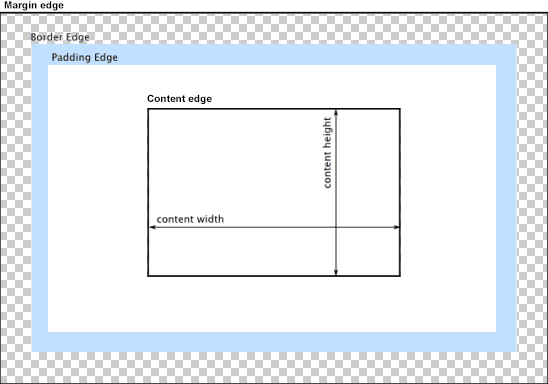
As we learned in this week's reading, a CSS box consists of four nested boxes:
- The innermost box contains the content of the element, such as text and images.
- The padding box contains the content box and a transparent area around the content. By default, it is the content's background color.
- The border box contains the padded content and adds an optional colored area around the padding. By default, it is also content's background color.
- The margin box contains the border box and adds a transparent area around the border. By default, it is the color of the parent element's background color.
We control the size and other features of each containing box using CSS properties of the same names:
-
The
paddingproperty specifies the thickness of the padding. -
The
borderproperty specifies the border's thickness, style, and color. -
The
marginproperty specifies the margin thickness.
We can also define values for each side of each box independent of the rest of the box.
Exploring the Box Model
HTML and CSS are the perfect medium for exploring how the CSS box model works. Let's create three boxes ...
<div>Before</div>
<div id="content">Content</div>
<div>After</div>
... and then add style to the parts of the middle box so that we can see each of the four boxes within the box model:
div { background-color: light-blue; }

#content {
  margin: 5px;
  border: 5px solid black;
  padding: 5px;
}
Collapsing Margins
Sometimes, adjacent boxes both specify margin between them. The browser does not add these values to create an even wider margin. Instead, it uses the smallest amount of space necessary to ensure that both boxes' margins are respected.
h1 { margin-bottom: 25px; }
p { margin-top: 20px; }
Recreating MDN's Box Model Image
The image of the CSS box from MDN used above may be a bit confusing, because the labels refer to the part inside the box where the label sits. So I decided to recreate the image using CSS.
Why did I use 484px for the div
that contains outer element?
I wanted the box to display exactly the width needed to contain its parts.
-
There are 254 pixels of content: the width of the
ptext. - There are 150 pixels of padding: 75px each on the left and the right.
- There are 30 pixels of border: 15px each on the left and the right.
- There are 50 pixels of margin: 25px each on the left and the right.
254 + 150 + 30 + 50 = 484
The linear-gradient property is beyond the scope of this course. It's an example, though, of how powerful CSS is.
A Quick Exercise
Add this element to the web page:
<div id="quizdiv">
  This is a <span id="quizspan">test</div>
  of the emergency broadcast system.
</div>
What will the block look like with these styles?
#quizdiv {
  background: lightgreen;
  border: 2px solid blue;
}

#quizspan {
  background: yellow;
  border: 1px solid black;
  padding: 2px;
  margin: 2px;
}
Why does the span's box extend outside the div's box?
Floating Items on the Page
Now that we have some understanding of how boxes work in CSS, let's return to thinking about how to create our desired layout. This involves us telling the browser to place the document's boxes outside the normal flow. The simplest way to do that is to tell an item to float.
The float property enables us to tell an item to
shift to the left of the page or the right of the page, with
text flowing around it. The item's location will be different
than if it appeared next in the top-to-bottom placement of
boxes on the page.
selector {
  float: left;
}
This web page uses a float to place the box model image above. I added some margin on the left so that the text of the page did ot run all the way to the image's border.
Seeing the layout with and without left margin tells us something important about how floats work: when we float an item and content then wraps around it, the browser shortens the lines of the content.
We can see this more clearly with
a simple example.
If we uncomment the background color property in the style for
p, we can see that the space given to the
paragraphs runs underneath the floated item. The browser
respects the float by shortening the lines of the content.
By adding margin on the right and bottom of the floated item, we ensure that floated item's box takes up more space, causing the browser to shortens the lines of text even further.
All the elements that follow a floated element will wrap
around that element, until the floated element ends and normal
flow resumes. If we want to resume normal flow sooner, we can
clear the float by adding the property
clear to the next item we want to be placed in the
normal flow. clear takes a value of left (to clear
items floated left), right (to clear items floated right), or
both.
Using the display Property
Floats are a useful tool, but they make only small a change to the standard layout algorithm. The browser uses normal flow but exempts an element, letting it slide to the side of the page.
The display property gives us much more power.
Two short examples in reading introduce simple uses of
display to tweak the standard normal flow
algorithm:
-
Use the value
noneto hide an element. Notice that the hidden element is taken out of the normal flow layout. When hidden, the space that would be allocated to its block is vacated and free to be used by the following block. -
Use the values
blockandinlineto change an element's display mode. If we addmargin: 0 100px;to the style of the heading, we can see how the inline placement respects their boxes. We change other block elements' display property as well — try it withps!
But display can do so much more than tweak the
standard layout... We can change the layout algorithm
entirely! We will look at flexbox layout next session, and
grid layout next week.
Using Devtools to Inspect CSS on the Web
When we see layout on the web that we admire, or want to imitate, we can use of our browser's dev tools to examine the styles used on a page. Modern web pages can be quite complex, with layers of style sheets using the most advanced CSS features, which can make our task daunting. But as we grow more confident in our skills, we will be able to learn from even complex pages.
Consider the header on Spotify's homepage.
-
We can see advanced uses of
display(inline-block, inline-flex, none) as well asbox-sizing: border-box;. - Most text is selectable as text.
- There are two stylesheets: lots of icons, small scripts.
-
h1has different font size, weight, .... - The header links are an unordered list, displayed inline.
- Links changes color on hover.
Closing
Here is the final version of the playground file we worked with today, if you'd like to check any of the layout choices we explored in class.