Session 12: Recreating a YouTube Search Page in CSS
The YouTube example uses code created by David Humphrey.
CSS Humor
Out on the CSS interwebs you may run across this meme in one form or another. Whenever I do, it makes me smile.
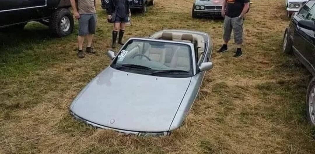
.car {
  margin-bottom: -200px;
}
But does it work? Let's see.
First, define the car class. Then add the
class="car" attribute to the img
element. What happens?
It turns out that negative margins are legal. They are subtracted from the positive margin of an adjoining box. You can see this in the CSS spec at W3C. This is what the MDN documentation says:
When negative margins are involved, the size of the collapsed margin is the sum of the largest positive margin and the smallest (most negative) negative margin.
Enjoy good humor, but never let a good meme go to waste.
Learn something.
:-)
Notice how the figure above uses what we learned last time to
place its caption on top of the image, using absolute placement
of one element on top of its containing element. You can see
the CSS for this in the style element included in
the head for this page. Use your browser's
developer tools to read the code.
Today we learn about about more sources of fonts and icons, and then study a re-creation of a YouTube search page in CSS.
More on Fonts and Icons
Web Fonts
In Session 8, we learned how to use a custom font from Google Fonts.
Each operating system provides some number of fonts that a web browser can use to style text. The browser has access to serif, sans serif, and monospace fonts. You can see a list of the fonts and OS support for them at CSS Font Stack.
Modern browsers also allow a website to include custom fonts as external files, downloading them as needed by a page. Many web developers prefer to use custom fonts, because they don't want to be limited to the set of fonts available on all operating systems. Those fonts make all pages look the same!
Many fonts are commercial products that have to be purchased, but there are also several sources of high quality, freely available fonts to use:
Icons as Fonts
In Session 10, we learned how to use freely available icons loaded as custom fonts from Version 5 of Font Awesome's library.
Font Awesome recently switched to Version 6, a new model for using its icons:
-
Go to
https://fontawesome.com/start. - Enter your email address to create a default "kit" of fonts.
-
Add your unique Font Awesome code in the
headof your page. For example:<script src="https://kit.fontawesome.com/1584495bf0.js" crossorigin="anonymous" > </script>
This example uses my custom Font Awesome kit:
https://kit.fontawesome.com/1584495bf0.js.
You can read more about how to use Font Awesome icons at
https://docs.fontawesome.com/web/add-icons/how-to.
Google also provides an extensive collection of icons at its Material Symbols page. You can read more about Google Material icons in the Material Icons Guide.
We will see examples of both a Google text font and the Google Material icons later in the session.
A Code Review Exercise
The reading assignment for today consisted of two files:
... that together re-create a YouTube search page. (Actually, they re-create an older version of the search page, before YouTube made a few small design changes. Today's search page looks like a bit different, but the basic features are all the same.)
Answer these questions about the code.
Use search in VS Code to find the elements or properties in
question.
What code in the HTML does the selector
#user-options > i target? How is it styled?
What does margin-left: -6px; do in the
#search-wrapper button rule?
What code in the HTML has an id of
filter? How is it styled?
Why is there a div in the HTML with an
id of video-card-wrapper when all it
does is contain two other divs?
How many different flexboxes are there on this page? List each and along with its components.
What happens to the layout if we make the window taller or shorter? Which part of the style sheet controls this?
What happens to the layout if we make the window wider or narrower? Which part of the style sheet controls this?
Code Review of a YouTube Re-Creation
Set Up
This code was created by David Humphrey in a live-coding session. At the start of the 90-minute session, David said,
I think that one of the best ways to learn CSS is to take a page you use all the time and challenge yourself to recreate it. For an extra challenge: don't look at the page's styles!
When starting out on such an endeavor, first make a general survey of the page and identify its major components. This will help you structure the page and choose basic styles.
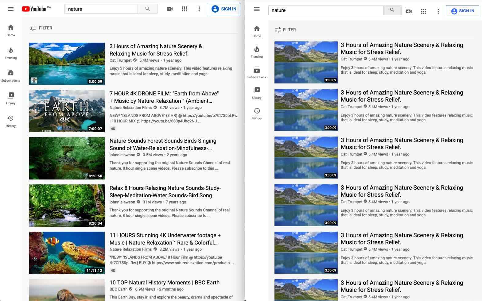
Check out this this side-by-side screenshot that shows a YouTube search page on the left and a re-creation of the same page on the right.
The YouTube page has a header along top, a navigation bar down the left side, and a main page in light gray for rest. Note that the scroll bar moves the main content, but not the header or the nav bar.
This survey sets up the first two rules in the style sheet.
The Header
There is a lot going on here. A few notes:
-
Make the header a flexbox. It is a container whose
components we want to layout flexibly. Google
justify-contentto get help with centering the content. Usespace-betweento push items on the ends to the edge of the window. - We do not include the Google logo in our emulated pages, or company logos more generally. They are trademarked.
-
The HTML
ielement does not mean "icon", but it has come to be used that way. -
Two of the
divs are named with a-wrappersuffix to indicate that they can contain other items. Sometimes this is because they will be flexboxes. -
The
search-wrappercontains a pre-filledinputfield and a button with a search icon. -
We make
search-wrappera flexbox. It plays roles in two flexboxes, one as component and one as container. -
When the window gets wider or narrower, only the
inputfield changes size. -
Make
user-optionsa flexbox, too, with components spaced evenly. -
We want to style the icons directly inside
user-options, differently from the icon on the button. So we use a new kind of selector,#user-options > i { ... }.
The Main Section
A few notes:
-
Override
overflow: auto;to allow scrolling in the main section. -
Use a
divto create a wrapper that contains the card image and the card information. -
The extra layer of indirection lets us use flexbox to layout
the two components. The card image remains the same size
regardless of window size, while the card information
divgrows and shrinks with the window. - How to place the runtime text on top of the image? Use absolute positioning within a relatively-placed container. Use z-index: 100; to make sure it sits on top of the image.
Closing
Homework 5
Homework 5 is due tomorrow.
What questions do you have?
Look at one or two of the specs?
This assignment has a lot of small parts. Most of the bullets entail a single property/value pair using a property that we have seen and used in class. Do the bullets one at a time, and reload the page after each addition. Don't wait until the last minute this time — you may need a little more time!
Homework 6
Homework 6 will be available soon. It is a short assignment that will help you review for the midterm.