Session 8: Using CSS to Style a Page
An Exercise
A great way to learn CSS is to use it to create the style of an existing page. I ran across an article with a simple look. We know enough CSS to re-create almost all of it, and are ready to learn the rest of the CSS we need. This page is our creative prompt for the day!
Consider the page. It starts with a header containing the title and two bits of supporting text, all in a sans serif font. The supporting text includes colored text and a link with a custom style. The title and main text have wide margins on the left and right. The main text is in a different sans serif font and has a single letter styled differently than the rest of the text.
We have seen or read about CSS properties for each of these features.
Your task: create a CSS file to re-create this style.
To get you started, I provide a starter kit containing:
- an HTML file with text similar to the prompt page, already marked with the tags we need to style
- a CSS file with one placeholder rule
- an image of the top of the prompt page, for your reference
- an image that you can use in your style, if you would like
To start, focus your attention on the image of the prompt page and create CSS rules to style the content.
Recreating the original page offers us two bonus challenges:
- put in a background image (or color) behind the header
- find a font that closely resembles the font on the page
Recreating the Style in CSS
Let's work our way down the page, creating CSS rules that morph the page in the direction of the prompt.
The Header
-
font-family: sans-serif;
We could examine the site's css to see which font they use. -
color: black;without a background image or color.
Let's save the background until after we implement the basic layout and fonts of the page. -
text-align: center;for all text in the header.
The h1 Heading
-
font-size: 2.6em;starting from 2.0em. -
font-weight: 400;starting from 500.
The default sans-serif font is a little thin. Let's come back to fonts later.
Now, notice the margins and line wrap.
-
margin: 0 120px 20px 120px;starting with 50px on left and right and then adding some to the bottom.
The h2 Heading
-
font-size: 1em;starting with 0.5em -
font-weight: 500; -
There is a
spanin the HTML. That text is red and bold!
color: red;
font-weight: bold; -
The anchor color matches the header and is not underlined.
color: black;
text-decoration: none; -
Notice what happens when we hover over the link: it shows a
border.
We can use thea:hoverpseudo-class from last timeborder: 1px dotted black;
The Byline
This is just a p element.
-
font-size: 0.75em;start with 0.5em -
margin-top: 90px 0 100px 0;start at 50px each
The Main Content
-
font-family: sans-serif;
The default sans-serif is not as good a match in the body as in the header. -
font-weight: 400; -
color: rgb(126, 126, 126);start with darkgray -
font-size: 1.1em;start with 1em -
Add margin on left and right. The margin is inside the
margin for the h1. Start with 120px.
margin: 0 260px; -
There is space between lines.
line-height: 1.75;starting with 1.5.
The First Character
This is known as a dropcap. In the HTML, it
is wrapped in a span with an id to
target. Recall that this is one of the uses of
div and span, to target styling.
You can do this in your HTML files, too.
Let's style our dropcap to match the one in our prompt:
-
color red;
Use the color picker to adjust color to a darker red, say,rgb(217, 2, 2). -
font-weight: bold; -
font-size: 3.6em;start with 4em
This affects spacing below the line... I didn't know how best to handle this, so I searched for a pointer online and found recommendations at CSS Tricks . This can be a useful tactic./ Beware, though. HTML and CSS have been around for a long time. Much of the advice online is out of date. Check the date of any article you consider and be sure that they refer to HTML5 and CSS3.
-
line-height: 0.9em;start with 2em -
padding-right: 0;
This may not be necessary.
Challenge: Adding a Background Image
Our reading for the week included a short section on
setting background properties
.
We can use a color as a background, perhaps black
or darkgray. This gives enough contrast for white
text (make the change), and maybe the red.
header {
  background-color: darkgray;
  height: 460px;
  color: white;
}
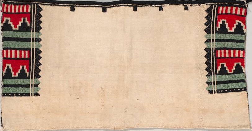
What about an image? The one in the article appears to be copyright of the owner.
I did a Google Image search for "native american blanket", narrowed to images carrying Creative Commons licenses. The one I liked best for this exercise is from the Cleveland Museum of Art, via the Wikimedia Commons. It is in the public domain, which means that we can use it without restriction.
I downloaded a reasonable size and cropped off the space around the blanket in the photo.
Now we can use url("blanket.jpg");.
This doesn't look right, because it starts the image at the far
left and then repeats. We need the repeat to fill the view,
but we need to add the center attribute so that the
tan hide of the the first image is in the middle of the view.
If necessary, we can use the repeat attribute to
fill the view.
header {
  background: url("blanket.jpg") repeat center;
  padding-top: 20px;
  color: white;
}
Not great, but not too bad. (Can we make the image more transparent?)
Using a Custom Font
The text in both the header and the main content are both clearly sans serif. However, the browser's default sans serif font doesn't look right to me in recreating this page. The characters are too wide. It looks even less good in the body.
I like fonts and have opinions about which fonts I like to use. But I don't have a well-developed eye for identifying specific fonts when I see them. So I peeked into the style sheet for the original article and see that they are using Open Sans in the body. Open Sans is one of the many fonts available from Google.
- "Select" a font. I chose Regular 400.
-
Then click on the shopping bag up top.
The page provides us with text we need to use the fonts. -
Now we can load it as a style sheet into our HTML file:
<link href="https://fonts.googleapis.com/css2?family=Open+Sans&display=swap" rel="stylesheet">
or import it as a font family into our CSS file:@import url('https://fonts.googleapis.com/css2?family=Open+Sans&display=swap');
One of the goals of CSS is to separate style information from
the content in the HTML file. I'm trying to do this exercise
without modifying the HTML file, as a test of our CSS chops.
So, let's use the @import version.
Add 'Open Sans' to the font family for main and header.
Factor the two declarations out to body {...}?
Do we need to adjust anything now with the new font?
Closing
Submit Your Work
Once you have worked through the entire exercise, log in to
the course submission system
and submit your exercise.css.
This is the first graded in-class exercise of the semester. I won't be grading these for correctness or even completeness. In-class exercises are for practice, so I will grade them for the good-faith effort you made during class.
Our Final Result
Here is a final version of our CSS file after the session. Grab a copy and play with it! Can you make our page look even more like the original?
As you have time, review the reading for this week and the two recommended sources it mentions. Familiarize yourself with what is available, so that you may remember the feature you need when you are styling a page.
Bookkeeping
Homework 3 is available and due on Friday. It is an "HTML-only" assignment, so you don't have to do any styling for the pages you create for the assignment. (You may if you wish!) Homework 4 — with CSS — will be available tomorrow.