Session 10: Flexbox Layout
The blog post exercise and example are adapted from code created by David Humphrey.
Download this starter code to use for the opening exercise.
An Exercise
Let's try out some of the CSS we learned about last time.
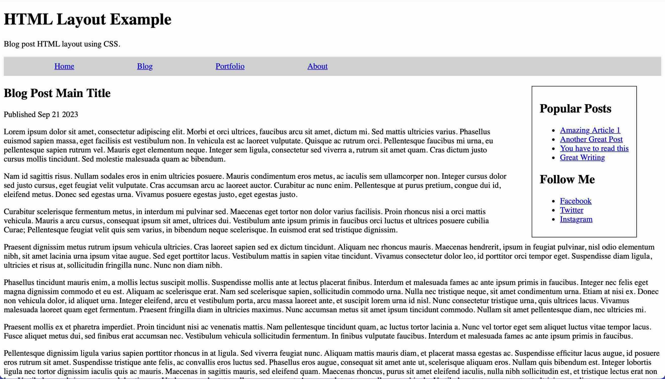
Here is the simple HTML file for a blog post.
Your task: add CSS to the style sheet to re-create this styled page.
In particular, your task is to:
-
display the
asideon the right side of the page, with a black border -
display the
navbar with a light gray background and the links placed horizontally, spaced out and without bullets
To get you started, I provide three files:
- the HTML file, already marked with the tags we need to style
- an empty CSS file awaiting your commands
- a screenshot of the layout goal
Remember: you can make the li elements flow from
left to right by setting its display property to
inline.
Solution: Here is
a CSS file
that does the trick. Unfortunately,
display: inline doesn't give us the vertical
spacing we'd like inside the nav. The value
inline-block does.
Download this starter code so that you can follow along with rest of the session.
Return to CSS Layout
We began our study of CSS layout by learning how we can tweak
normal flow layout using the display and
float properties.
In Flow and Out of Flow
One important idea we saw: We can describe CSS elements as being in flow or out of flow. Elements in flow are given space that is respected by the other elements in flow. If we take an element out of flow, say, by floating it, the space for that element is no longer respected by other in flow items. We need to manage potential overlaps ourselves as the normal rules of block flow layout no longer apply.
Border Box Sizing
One thing we did not talk about is that CSS boxes may not work the way we expect them to. When we define the width of an element, that size applies to the content of the element. The padding and border are outside of the content box. This means that the space allocated to the element is more than the width we defined.
See this example that contains a single element: a colored region, 100 pixels square. Inspect the box in your browser's dev tools. The content takes up more space than the width allocated to the box due to the padding and border.
Hence the desire for border box sizing.
box-sizing : border-box;
Toggle the border-box declaration on. Notice
that the content box is shrunk co that the content, padding,
and border fit in a box of the specified size.
If border box sizing helps you as a designer, feel free to use it. If you'd like to read more, check out CSS Tricks or I Am Kate.
Next Up
Today, let's learn about Flexbox, another way to use CSS to lay out a webpage.
Flexible Box Layout (Flexbox)
Flexible box layout, or flexbox, is a method that lays out content in one dimension. The default is to lay boxes out in a row.
To give a container a flexbox layout, we use the
display property we learned about last time, with
a value of flex. For example:
.flex-container {
    display: flex;
}
When we do this the children of the element are now laid out as flex items. By default, the browser will lay them out in a row, aligned to the starting edge (left) in the inline direction (left to right).
When a container is set to use flexbox, we can define several other properties on the container to control the layout:
-
We control the direction and order of the layout by using the
flex-directionproperty. -
We control the spacing of the items in the container by using
the
justify-contentproperty. -
We control the alignment of the items in the container by
using the
align-itemsproperty.
To take greater control layout, we use these properties on the
items in the container: flex-grow,
flex-shrink, and flex-basis.
-
The
flex-basisis the size allocated before any growing or shrinking takes place. -
The
flex-growandflex-shrinkproperties allow us to control what happens if there is more space than needed to place the items, or not enough.- If one of these properties has a value of 0, the size of the item will not be changed (grow or shrink).
- If the property is set to a positive number, then the browser will grow or shrink the items space as necessary to fit the line. The magnitude of the numbers lets us control the proportionality of the growing and shrinking.
More commonly, we use the shorthand property flex
to specify all three at once.
flex: grow shrink basis
We can even control the order of the items in the box using
the order property.
Here is this final version of the CSS we created while exploring flex layout. Feel free to play with it as you explore how the flexbox model works
Recreating the Blog Post Style in CSS
Let's use flexbox layout and CSS styling to turn the blog post from the opening exercise into something that looks like a professional template.
First let's add styling to the HTML elements so that they look more attractive. Here's a style sheet that we can link into our HTML file that gives the elements of our post a more modern look.
Some items of note:
- The page uses two custom fonts from Google: See Session 8's notes for how to find and link in fonts.
- The main content has a maximum width and let's the browser set the left and right margins.
-
The
blog-titleclass lets us style the header with a background image that sets of the title and publication date. -
The
asidestill has bullets on its list items. -
The Responsive Sizing rule at the bottom tells the
browser not to display the sidebar if the screen goes below
960 pixels wide. We'll discuss
@mediarules and responsive design later in the semester.
Next, let's use flex layout to improve the nav bar.
We let the "About" link grow, which together with its right
alignment pushes it to the side of the bar.
Now, let's use flex layout to make the main
content look the way we want. We'll have the article take 3/4
of the space and the sidebar 1/4.
To swap the two items on the page, we can use the
order attribute. This is not the preferred
approach when designing for accessibility, because it creates
a disconnect between the order of the elements in the HTML file
and the order of the elements in the display. It would be
better to move the aside element after the
article element in the HTML document!
Finally, we need to fix the look of the sidebar. We can
eliminate the bullets by setting a property on
aside ul elements.
What about the icons for the social media platforms?
Font Awesome
provides many, many icons as characters in a font, including
brand logos such as Instagram. You can
search for icons
and copy the HTML it provides into your HTML file. That code
refers to classes that we import into our CSS, or link to within
the document's head.
The result:
What about the print style sheet? We use it to
define styles that will be applied only when the medium is
print. If someone prints out this article, they don't need
the page heading, the aside, or the nav. The heading is there
for the course web page, and the other two items are for
navigating on the web. None help in print.
Closing
Don't forget that Homework 4 is due tomorrow. Homework 5 will be available soon.