Session 11: Positioning and Scrolling with CSS
The blog post example is adapted from code created by David Humphrey. The sections on positioning, z-index, and overflow are adapted from MDN.
Download this starter code to use for the opening exercise and so that you can follow along with rest of the session.
An Exercise
Beginning web developers sometimes like to use
button elements for links because they like the way
buttons look. We don't need the functionality of a button yet,
though, nor do we know how to control the button's function with
JavaScript. We just need links.
Fortunately, CSS gives us the power to control the way elements look on our pages. And you now know more than enough CSS to make your links look like buttons! Let's do it.
Here is
an example
of what I mean. The page contains a regular link using
a, a regular button using button,
and a link using a that is styled to look like
a button,using a class named button.
Your task: write CSS for the button
class.
Here are a few properties you'll want to set: text decoration
(none), background color, border, and border-radius.
On hover, change the text's color or underline it.
It turns out that making buttons and links look similar is a common task in the web development world. Here is a more advanced example that makes buttons and links look identical. If you would like to learn more, check it out!
Review of Last Time
We began our study of CSS layout last week by learning how we
can tweak normal flow layout using the display and
float properties. Then we learned that using the
property/value pair display: flex enables us to
change the layout algorithm entirely.
Today we learn about properties that enable us to position elements more precisely, including in 3D, and to control scrolling.
Position
CSS defines properties that allow us to take elements out of normal flow and to display them differently than they might appear otherwise. For example, we might want to have one element sit on top of another, or always remain in the same location within the window.
We can implement several different kinds of positioning, using
the position property.
Consider this page. Let's add this code to the styling:
.positioned {
  position: static;
  background: yellow;
}
... and then add this attribute to the second paragraph:
class="positioned"
The CSS gives the paragraph a static position, which puts it into its normal position in the document flow. As you might imagine, that is the default position for every element. When we reload the page, we will see no change.
Now change static to relative.
Again, there is no change to the rendered page.
relative is still in relation to the normal flow.
If we want to change the element's position, we have to define
how it is different from its expected position. Add:
top: 30px;
left: 30px;
Now the paragraph moves right 30px and down 30px from its position in the normal flow. It is still in the normal flow, but we have displaced it from its default position.
Now change relative to absolute.
Whoa! An absolute position takes the element out of normal
flow. You can see that from the fact that there is no space for
the second paragraph between the first and third paragraphs. It
now sits on its own layer separate from all other
elements.
Absolute positioning enable us to create features that are isolated from the layout of other elements on the page, which can be useful for information boxes and popup menus.
For absolute placement, the top: and
left: displacements are in relation to the
initial containing element, which here is the
html element. The paragraph is positioned in
relation to to the root of the document, and jumps to the upper
lefthand corner of the window, right and down 30 pixels each.
The paragraph displays as if it is no longer part of the
body — because it's position is not.
We can change an absolutely-positioned element's containing
element by changing one of its ancestor's position
property. If one of the ancestors is declared to be
relative, then it becomes the reference
point — the containing element — for any absolute
children.
Add:
position: relative;
to the body's CSS rule. The result is that the
second paragraph's absolute position is now computed relative to
the body's box. We have changed paragraph's
positioning context. Now, the
top: and left: displacements are in
relation to the box for the body. It is placed 30px right and
down from the upper lefthand corner of the body, placing it
askew and on top of the first paragraph.
One last possible value of position for now:
fixed, which is like absolute, but
in relation to the visible part of the window. This can be
useful for fixing a menu at the top of a page, so that it is
always visible no matter how much the page scrolls. You will
want to use position: fixed; in
your homework assignment
this week.
Z-Index
When elements start to overlap, the browser has to determine which elements appear over others and which elements appear under. In our examples thus far, we have had only one positioned element. Positioned elements have precedence over non-positioned elements, so the positioned paragraph displays on top. What if we have more than one positioned element?
Consider again our positioning example. Let's add this code to styles:
.first-paragraph {
  position: absolute;
  background: lime;
  top: 10px;
  right: 30px;
}
... and then add this attribute to the first paragraph of the document.
class="first-paragraph"
Alternative styling: Recall that CSS has an extensive set of selectors available to target styling. One, the :nth-child() CSS pseudo-class , matches elements based on their numerical order in the list of all such elements contained in a parent. Instead of creating and using a class namedfirst-paragraph, we could instead target the firstpelement with a selector ofp:nth-of-type(1).
We now see the first paragraph moved out of normal flow,
positioned a bit above where it originally was, and stacked
below the .positioned paragraph. The
.positioned paragraph comes after the
.first-paragraph paragraph in the document, and
positioned elements later in the document have precedence over
positioned elements earlier in the document.
To change the stacking order we use
the z-index property.
z-index refers to the z-axis of a web page.
Up to now, we have been controlling placement of elements in a web page as if it were a flat surface, using 'left' and 'right' along the x-axis (horizontal), and 'top' and 'bottom' along the y-axis (vertical).
Web pages also have a z-axis: an imaginary line that runs from
the surface of the screen to eyes of the the user.
z-index values affect where positioned elements sit
along that axis. A positive value moves the element up the
stack toward the user, and a negative value moves it down the
stack toward the screen. By default, each positioned element
has a z-index of auto, which is essentially 0.
So, to move the first paragraph on top of the second, we can
give it a positive z-index that moves it closer to
the user than the second:
.first-paragraph {
  ...
  z-index: 1;
}
Now the lime paragraph appears on top of yellow paragraph, because it has a higher z-index. The browser displays both on top of the third paragraph, because they are positioned and the other paragraphs appear in the normal flow.
The values of z-index are unitless numbers. They
describe a relative order along the z-axis. We could have used
2 or 300 in place of 1 in our code, with the same effect.
Overflow
What happens when some content, such as text or an image, is too
big for its box? We can control how that content is displayed
using
the overflow property.
The first choice is between letting the content show outside the box or "clipping" it at the margins. The second choice is: for clipped content, do we let the user scroll to see the content that does not fit?
Consider
this page.
The p's contents are too large for their box,
which has been set at 200px tall.
Set overflow: visible. There is no change in the
page, because 'visible' is the default.
Set the value to clip. This trims the excess at
the boundary. There is no way for the user to see it.
When it comes to the scrolling choice for clipped content, we have three main options:
-
Set the value to
scroll. The browser displays scroll bars and lets the user scroll through overflow content. -
Set the value to
auto. Users can scroll through overflow content. The browser displays scroll bars only if they are necessary. For example, if some text is deleted, the content may fit in the box and no longer overflow. -
Set the value to
hidden. This trims the excess at the boundary, likeclip, but enables scrolling through program actions in JavaScript.
The use of overflow enables us to restrict large
content to a smaller space on the displayed web page and then
let the user scroll through the overflow content in that same
space. It also makes it possible to let some elements on a
page to scroll, but not all, such as the main content of a blog
post.
Applying Positioning and Overflow to the Blog Post Example
Let's use these three properties to add features to our blog post from last time.
Confine Scrolling to the Content of the Post
First, we will make it so that the user scrolls only through the main content of the page (the post itself), with the rest of the page fixed. This feature requires several interacting changes to the style sheet, so let's look at an implementation rather than build it live:
There are no changes to the content for this feature, so the HTML source file is unchanged. There are three changes in the style sheet:
-
Lines 20-23: We hide the scroll bars for
the entire document. In order to make scrolling work for
a portion of the page, we also have to ensure that the
bodyuses the full height of the viewport. -
Lines 26-33: We fill the height of the
available
bodyin a vertical column with its four parts: the header, the links bar, the main content, and the footer. One way to do this is to make the body a flexbox and setflex-direction: column. -
Lines 95-98: Finally, we let the
contents of
mainscroll. Settingflex: 1;while leaving the other components with the default 0 value ensures thatmaingrows to fill all available space in the body.
Note that main plays different roles in two
different flexbox layouts. It is a flex container that lays
out the article and the sidebar left to right, and it is a
flex component inside the body, a flex container
that lays out its components top to bottom.
CSS layout can become complicated as we try to do more ambitious tasks. Experience will help you manage some of the complexity. Sometimes, we seek help from more experienced colleagues.
Add an Image with a Caption Positioned on Top
The body of the blog post is a wall of Latin text, so let's
add
an image
to the HTML file using figure.
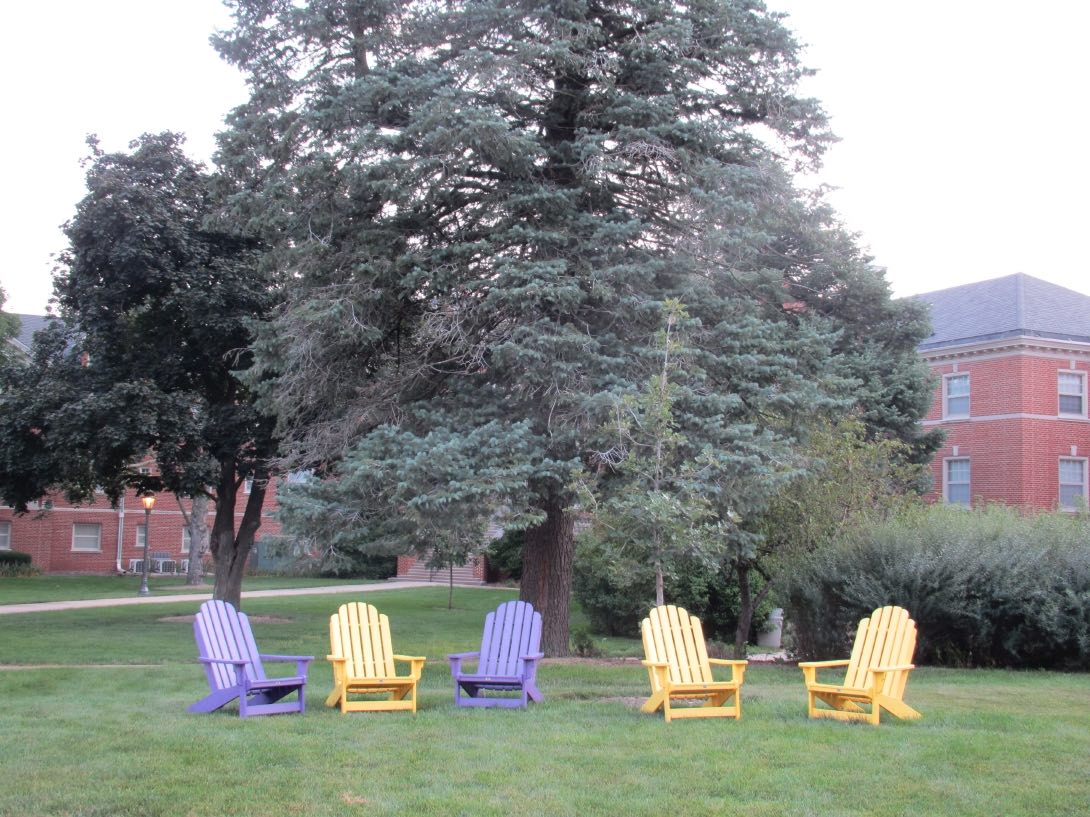
<figure>
  <img
    src="images/gathering-place-thumb.jpg"
    alt="purple and gold chairs outside Bartlett Hall"
  >
  <figcaption>Credit: Eugene Wallingford, 2013</figcaption>
</figure>
Now, let's style the image.
-
Style the image and figure as the same width. The top of
the image blends into the white background of the page, so
let's give the image a border.
figure { width: 500px; } img { width: 500px; border: 1px solid rgb(43, 43, 162); } -
Style the caption as we would like it to look. Once we add
the background color, we see that we need some padding. The
caption runs the full width of the figure, so let's fix its
width at a value that boxes in the text.
figcaption { font-style: italic; font-size: 8px; color: black; background-color: rgb(178, 225, 178); padding: 5px; width: 130px; } -
Place the caption on top of the image. Make the caption's
position absolute, relative to the figure. Place it in the
lower right-hand corner.
figure { position: relative; } figcaption { position: absolute; bottom: 15px; right: 5px; } -
Use
z-indexto guarantee the caption appears on top of the image. (It will by default, because the caption appears after the image in our HTML file.)img { z-index: 0; } figcaption { z-index: 1; }
Ta-da! Here is the final version of the code:
The best way to learn these techniques is to try them out on your own web pages, look up details that you have forgotten, and ask for assistance when there is an effect you can't seem to get right.
Closing
Homework 5 is available. It may look imposing, but most of the bullets requires only one property/value pair. Do them one at a time and reload the page, and you'll be able to see steady progress.
Reading assignment: On Thursday, we will study a re-creation of the CSS layout for a YouTube search page. Download this zip file and read the HTML and CSS files in tandem. Try to figure out what each part of the style sheet contributes to the displayed page. Make notes about any questions you have as you read.