Week 5: More CSS, Including Layout
This reading draws heavily from a page by David Humphrey.
Recommended Readings
You can continue to refer to CSS Basics and especially CSS Reference at MDN. Today's notes contain many links into the CSS Reference.
The CSS Box Model
The box model specifies how the various attributes of an element's sizing relate to one another.
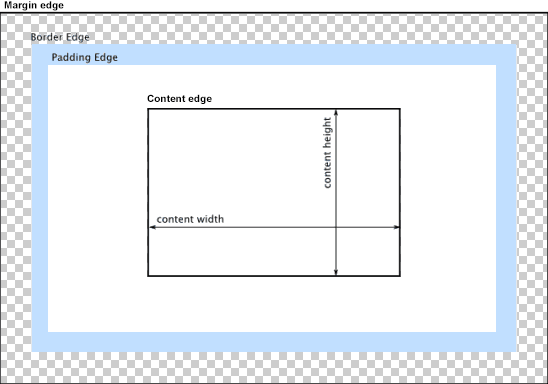
Each element on a web page can be considered to be a box. The box consists of four parts:
- margin: the space between the element and its surrounding elements
- border: the line (or lines) surrounding the element
- padding: the space between the border and the inner content of the element
- content: the actual content of the element — the text, the image, and so on.
This image shows the four parts of a CSS box:
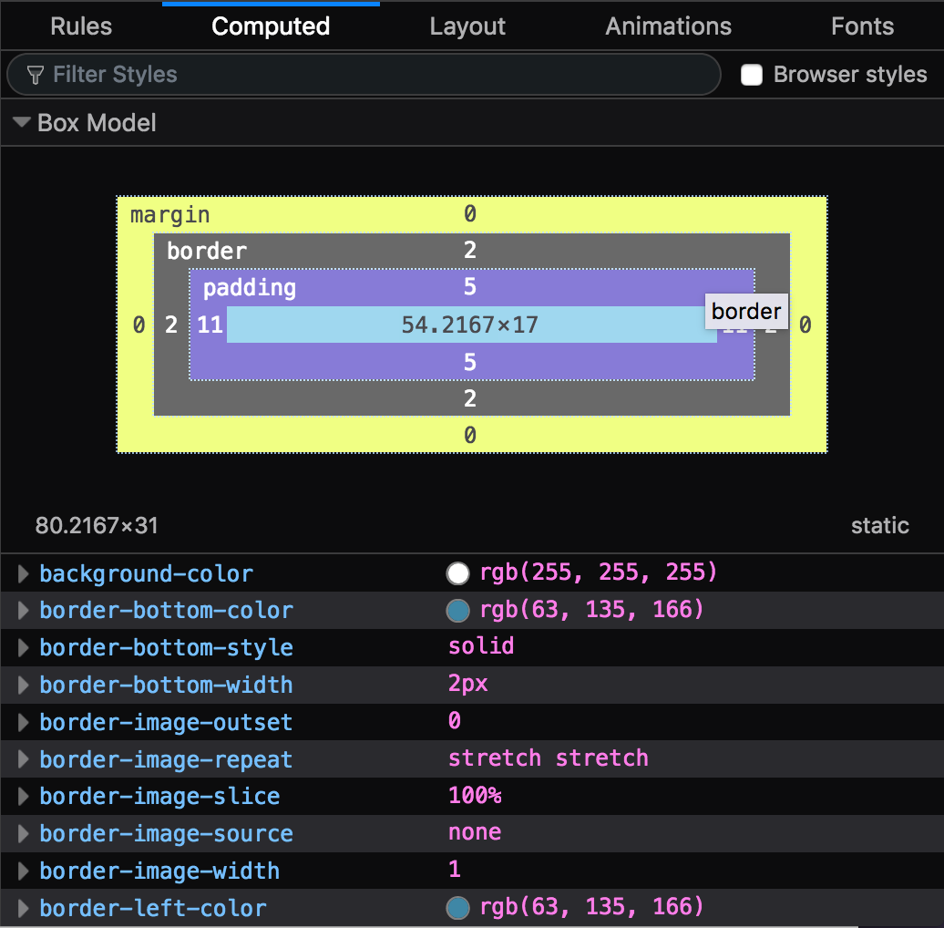
Another way to visual the box model is by using your browser's developer tools, which have tools for viewing and altering each of these parts. Here is an image of an element's box from Firefox:
The sizes of each of the margin, border, and padding can be controlled using the following CSS properties:
margin, border, and
padding are
shorthand properties
that let us give values to multiple CSS properties related to
the element at the same time. For example, the following are
equivalent:
/* Use separate properties for all aspects */
.example1 {
    border-width: 1px;
    border-style: solid;
    border-color: #000;

    margin-top: 5px;
    margin-right: 10px;
    margin-bottom: 15px;
    margin-left: 20px;
}

/* Use shorthand properties to do everything at once */
.example2 {
    border: 1px solid #000;
    margin: 5px 10px 15px 20px;
}
In the code above for margin, notice how the the
different portions of the margin declaration are
translated into a single line. The order of the values follows
the clockface, with numbers beginning at the top
and going clockwise around the dial:
.example2 {
  /*      top right bottom left */
  margin: 5px 10px  15px   20px;
}
We often shorten our lists when multiple properties have the same values:
.example3 {
  /* Everything is different, specify them all */
  margin: 10px 5px 15px 20px;
}

.example4 {
    /* Top and bottom are both 10px, right and left are both 5px */
    margin: 10px 5px;
}

.example5 {
    /* Top, bottom, left, and right are all 5px */
    margin: 5px;
}
When two elements appear next to one another on the page, the browser does not add their margins to create a larger margin. Instead, it combines (or collapses) the margins into a single margin, whose size is the larger of the two. Consider the following CSS and HTML from this example document :
<style>
  h1 { margin-bottom: 25px; }
  p  { margin-top: 20px; }
</style>

<h1>Heading</h1>
<p>Paragraph</p>
The styles call for the <p> element to have
20px of whitespace above it. However, the
<h1> already has 25px of
whitespace below it, which is more than the paragraph needs.
So, when the two are placed together on the page, the distance
between them will be 25px = max(20, 25),
not 45px = 20 + 25. The browser makes sure to
respect both margins, but it does not add them together.
Controlling Layout with the display Property
CSS lets us control how an element is displayed on the page. This is a large topic, too large to be covered in its entirety within a single introductory course. For now, let's consider some of the most common display types. We would need to study each layout method in more detail to fully appreciate the subtleties of each.
Up until now, we have been talking about the elements in an HTML document. At this point, it is useful to understand that the browser also creates a render tree, which is a tree of elements as they should be displayed in the browser. The elements in the document can be rendered in many different ways depending on the type of display we specify in the CSS. An element may even exist in the HTML document but not appear in the render tree at all!
To get started understanding display types, let's look at what
display: none; does, as seen in
this document:
<style>
  .hidden {
    display: none
  }

  .error-msg {
    color: red;
    /* other styles for error message UI */
  }
</style>

<div class="hidden error-msg">
  <h1>Error!</h1>
  <p>There was an error completing your request.</p>
</div>
When an element has a display type of none,
nothing will be painted to the screen. This includes the
element itself, but also any of the elements it contains (its
children). This allows us to create aspects of
a page but not display them immediately. For example, we might
want to reveal a dialog box or an information message only in
response to the user performing some action, such as clicking a
button. Or, we might want to remove an element from the page
based on an event, such as a "loading page" message after the
web page is fully loaded. (We will learn more on these ideas
later when we study JavaScript.)
If an element has a display type other than none,
it is included in the render tree and eventually painted to the
screen. If we don't specify a display type, the default is
inline for inline elements (such as
<a> and <span>) and
block for block-level elements (such as
<p> and <div>).
With inline, boxes are laid out horizontally
— typically left to right, starting at the top corner of
the parent element.
With block, boxes are laid out vertically, using
margin to determine the space between them.
To understand the difference, open
this snippet of code
in a page, then change the display from
block to inline:
<style>
  h2 {
    display: block; /* try changing to `inline` */
  }
</style>

<h2>One</h2>
<h2>Two</h2>
<h2>Three</h2>
We can also control the way elements are laid out within another element, that is, how its children are displayed. Some of the display types for inside layout options include:
-
using
table: make elements behave as though they were part of a<table> -
using
flex: lay the content out according to the flexbox model -
using
grid: lay the content out according to the grid model
We will study the flexbox model soon, and perhaps the grid model.
A great way to learn a bit about the latter two is to work through the following online CSS learning games:
A Quick Glossary of Common Layout Tasks
-
How do I center inline text horizontally?
p { text-align: center; } -
How do I center a block element's contents?
.center { width: 400px; /* set a fixed width */ margin: 0 auto; /* allow the browser to split the margin evenly */ } -
How do I center something vertically?
.vertical-center {
  display: table-cell;    /* make the element work like a cell in a table */
  vertical-align: middle; /* align to the centre vertically */
  text-align: center;     /* align to centre horizontally */
}