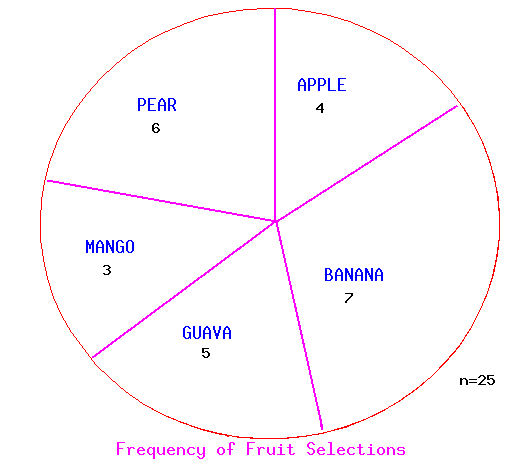
If one had a protractor (and the pie chart was accurately drawn), one could determine 16% of the fruit were apples, 28% were bananas, etc. Pie charts may also be labelled with more information including the actual counts.
One means to display categorical data is with a bar chart. Several parallel bars are used, with the height of each bar proportional to the number of data in each category. For example, if one had 4 apples, 7 bananas, 5 guavas, 3 mangos, and 6 pears, the information could be displayed thus:
       |          ___
       |         |   |                 ___
     5_|         |   |   ___          |   |
       |   ___   |   |  |   |         |   |
       |  |   |  |   |  |   |   ___   |   |
       |  |   |  |   |  |   |  |   |  |   |
       |  |   |  |   |  |   |  |   |  |   |
       |__|___|__|___|__|___|__|___|__|___|__
            A      B      G      M      P

          Frequency of Fruit Selections
Note that it is necessary to label the bar graph to convey information, in
particular the number of fruit is indicated on the vertical axis.
Alternatively, one could record the relative frequency of each type of fruit
in which case the actual number of each type of fruit could not be read from
the bar chart. A relative frequency bar chart would look essentially the
same, but the vertical axis would be labelled differently:
       |          ___
       |         |   |                 ___
   20%_|         |   |   ___          |   |
       |   ___   |   |  |   |         |   |
       |  |   |  |   |  |   |   ___   |   |
   10%-|  |   |  |   |  |   |  |   |  |   |
       |  |   |  |   |  |   |  |   |  |   |
       |__|___|__|___|__|___|__|___|__|___|__
            A      B      G      M      P

       Relative Frequency of Fruit Selections
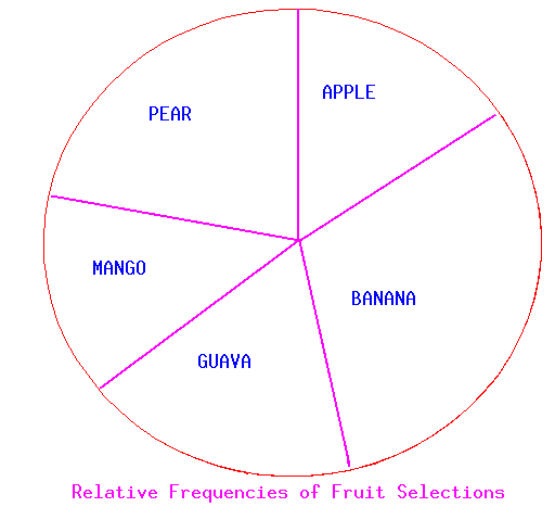
This information can also be displayed in a pie chart, which by its manner of
display emphasizes relative freauencies (i.e., parts of the whole).
If one had a protractor (and the pie chart was accurately drawn), one could
determine 16% of the fruit were apples, 28% were bananas, etc.
Pie charts may also be labelled with more information including the actual counts.